
THE REDUCE CLINIC
The Reduce Clinic approached us with a new business concept—providing NHS-backed weight loss treatments through prescription medication, ensuring eligibility screening and ongoing medical consultations. They needed a full brand identity and website to establish trust and credibility while standing out in a competitive market.

THE PROCESS
I started by researching the industry, analysing how similar companies use modern branding and social media-driven marketing to attract clients. Using this insight, I developed a mood board and experimented with branding concepts that felt fresh, medical, and consumer-friendly.

THE RESULTS
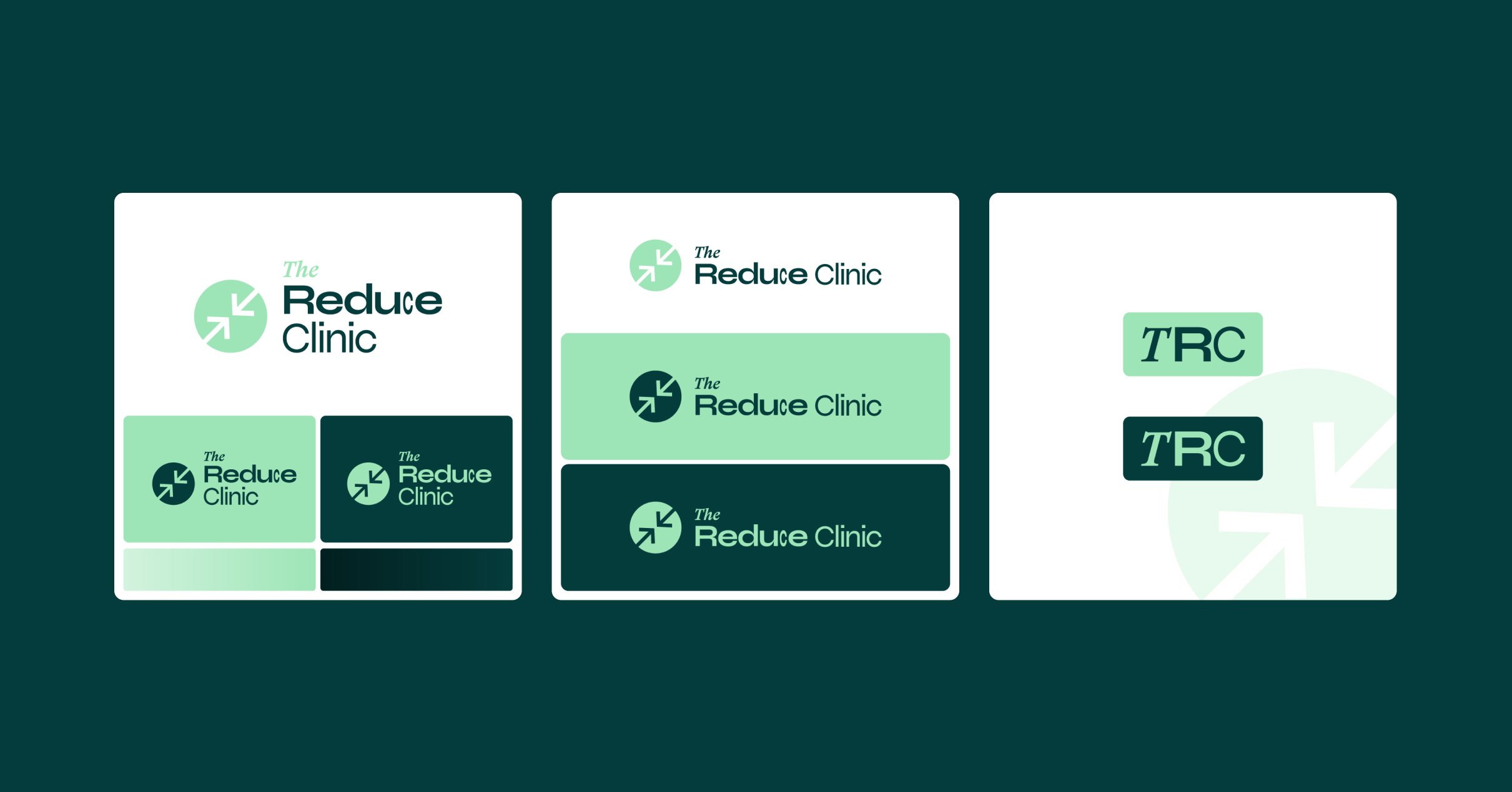
The result was two distinct branding directions:
A modern, trend-driven concept with clean typography, subtle gradients, and bold colour contrasts, designed to appeal to digital-first consumers.
A more corporate, professional look that aligned with the clinic’s NHS-backed credibility while maintaining a modern touch.
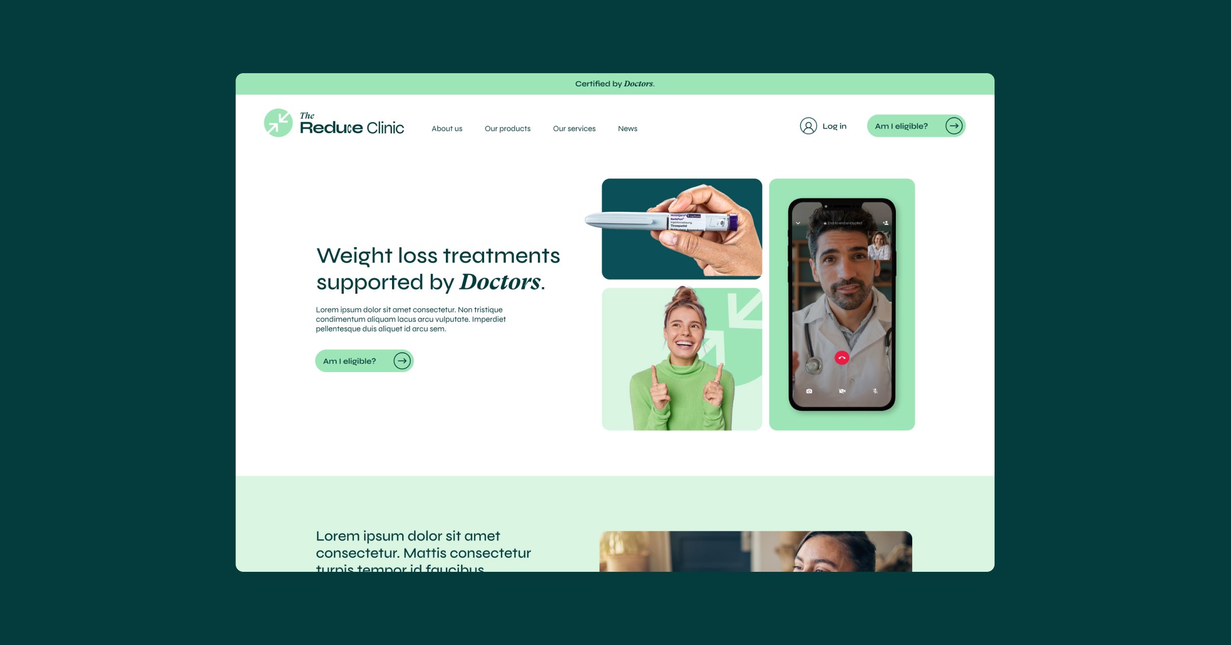
I applied these branding directions to website mockups, typography, and social media templates, ensuring consistency across all touchpoints. While the client ultimately chose a more corporate route, I really enjoyed the creative process behind these concepts—so I’m featuring them here as a showcase of my approach to branding in the health and wellness industry.